Saturday, 26 January 2013

Evaluation question 3: What have you learnt from your audience feedback? (part 2)

Below is a video with our audience feedback.  It also includes us discussing what we learnt from our audience feedback.


Evaluation Question 3: What Have You Learnt From Your Audience Feedback? (part 1)

This is the survey we created on Obsurvey to get feedback for our trailer.  We posted this survey onto our blog along with our trailer.  We also posted it onto Facebook to get feedback from our friends. Below are screen shots of the survey we created and the feedback we recieved. We have also posted a video of feedback that we also received from interviews as well as us discussing what we learnt from this.


Thursday, 24 January 2013

Evaluation Question 2: How effective is the combination of your main products and ancillary texts?

Below is a video of a voiceover of us talking about the different aspects of our trailer and how these linked with our finished poster and our magazine cover.

Wednesday, 23 January 2013

Evaluation question 1 (part 2)

Below is a prezi with a second part to evaluation question 1.

Evaluation question 1: In what ways does your media products use, develop challenge forms and conventions of real media products?

Below is a video montage of a presentation we created using iMovie to answer Evaluation Question 1.


 Other Notes:

  • We also used one other sound at the end of our trailer 'L490' by 30 Seconds to Mars. We used this sound as we felt it helped bring the music to a slow end. We also felt it went well when the word 'DIE' appeared in individual characters at the end of our trailer, as it allowed the sound 'Alien Impact' to be heard more clearly building up a sense of anxiety for when the final part of our trailer appeared which is when the masked figure appears in the lighting of the match behind one of our characters.

  • Sounds we didn't use;
    1) 'A Downward Spiral' by Nine Inch Nails. We didn't use this particular sound track as we didn't feel it gave the right atmosphere for our trailer as it sounded quite machine like. We both agreed that this soundtrack might be better for a more sci-fi movie rather than a supernatural thriller which is what our trailer is based on.
    2) 'Metamorphis' by Trentemoller. Listening to this sound now we really wish that we used this at the end of the trailer, and we can't understand why we didn't. We feel that the ending of this song would of been perfect in building up that atmosphere, anxiety and tension for the climatic end of the trailer where the mask figure appeared, rather that the sounds we did use 'L490' and 'Alien Impact'. If we could go back to the editing stages of our trailer, we would of definately of used the ending to this sound.

Tuesday, 22 January 2013

Evaluation progress

Here is the presentation we created to be presented as a green screen with us talking about each individual slide with us talking in front of it.


We are currently in the editing stages of this presentation and green screen montage. We filmed us in front of a green screen on Friday 18th January (last week).  As we were using a green screen for the first time, we were a little unsure of how it worked, but we are now confident with using it and are prepared to tackle any issues we may face in the editing stages as we have faced many issues before with editing our actual trailer.

Thursday, 17 January 2013

Monday, 17 December 2012

Our finished Magazine cover

Below is our finished Magazine cover that we created using Photoshop, On the next post you can see how we came to make our finalised image. We are very pleased with the outcome and we both agree that it matches the style of the Little White Lies Magazine layout.


Thursday, 13 December 2012

Magazine Cover- Initial Ideas 1

Here is one of our initial ideas, for our magazine cover. It is in the style of Little White Lies' magazine covers. One of the covers that inspired us to create this was for "The Skin I Live In" as you can see from the image below.

The text on the back of our image will be very subtle but noticeable enough to be read. We will blend the mask into the background which will be black in colour, therefore the text that reads "Experiment X" we are thinking about either putting in a grey colour or red so it stands out. And of course we will then have the Little White Lies company Logo situated at the top of the masks head.


Wednesday, 12 December 2012

Survey

Below is our final media trailer, and a survey that we would like you to complete to gain feedback on what was good and wasn't so good about our trailer. Thank you.

Tuesday, 11 December 2012

Research on Magazine Ideas

Now we have finished our main trailer and poster we are now beginning to create a magazine cover. To help us with ideas of what type of magazine cover to replicate I have posted below different magazine covers from 5 magazine companies which are; Empire, Total film, Sight and Sound, Little White Lies and Studio. I have also briefly discussed each one suggesting why or why not this particular design or magazine layout would be good for our particular genre.


Empire 


Empires magazine layout is a possibility considering it is the worlds No.1 film magazine. This would allow our film to get as much distribution possible and allow many people to know about our trailer. Our idea at the beginning of making the trailer for our target audience was to try and make it as mainstream as possible by having it appeal to both male and female audiences. We also liked the way that some issues used main characters from the films they are advertising such as this one of 'Bane' and some covers featured part of the set as well. This would give us some choice into the type of angle we would like to present our trailer as. The overall composition of the magazine is very busy with lots of different sized text, this could be quite tricky to replicate for a horror film unless we created it as a Halloween special. We also liked how the image overlaps the title slightly showing that the magazine must be very well known, otherwise  some people may just think its called 'EMRE' or 'EMPE' this is something we would need to be careful of if we decided to replicate this style in our own way.


Total Film
Similar to that of Empire, Total Film again is very busy in terms of composition. The genre of our trailer being a supernatural thriller we think wouldn't fit with the colourful orange handwriting, as we feel it would ruin the effect of our trailer which is to make people think its creepy and scary and want to see it for that very reason. Again as I stated with the Empire magazine the images cover part of the title, something we need to think about and can only really do if replicating an Empire or Total film magazine. So far our preference would have to be Empire, it is less cluttered and busy even though Empire magazine is quite busy, and would give us the best chance of advertising our film to a mass audience.


Sight & Sound

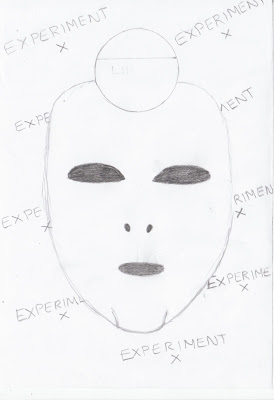
In our opinion we found that this magazine would not be suitable for our genre of film. This is simply to do with the fact that this certain design has a much classier feel to it and tends to feature a portrait of either the main actor of the film or the director. In our film the mask is the most symbolic thing about it, if we were to use this on a magazine like 'Sight & Sound' it may look out of place. This is because this particular magazine isn't meant to scare the audience. We also get the feeling that this magazine may be aimed at an older audience as it generally tends to feature older actors, the film 'Tinker Taylor Soldier Spy' featured on the cover of the left was also a film favoured by older people which supports this idea.


Little White Lies

At first we were not to keen on the presentation of the title used for the 'Little White Lies' magazine. However as I stated before the mask in our film is very symbolic and that is the only thing we could really use to show what our film is about. We both agree that this magazine covers composition being so simple that you only need one image and no text apart from the slight subtle text of the title printed in some artistic way is quite interesting. The overall magazine covers are quite arty and almost cartoon like. The reason we choose to present the cover for 'The Skin I live in' is is because it has a similar masked image to the one used in our film, and gives off a slightly creepy feel which is what we want our magazine to give off. This is our favourite design at the moment as it is so simple yet quite startling, which is what we are looking for.


Studio


This magazine cover is completely not suitable for our genre and style of film. The classy almost vogue like style would never in think of presenting a supernatural thriller as it's front page cover. This is very much like the magazine 'Sight & Sound' in the fact that it gives off the impression it is meant for a certain genre or audience, in this case women. The types of film you may find on the cover of this magazine would be romances, dramas and old fashioned movies that have been re-made.


To conclude from our research we are currently deciding between either Empire but maybe a simplistic version like the one below or Little White Lies.  We will post our final choice and magazine designs in a later post.

Finished Poster

Below we have posted our finished poster, we are both really pleased with the outcome and feel it fits very well with the genre of supernatural thriller. It was quite challenging in some places especially for Jessica who had never used photoshop before, but the overall outcome and look of the poster we think is pleasing. At the beginning creating the poster was quite slow because we were not really sure what type of look we were going for but after drafting up ideas presented on the previous post we then selected one that we felt included all different aspects of our film such as the camera and the mask.

Saturday, 8 December 2012

Steps to making our poster

Below are a few screen grabs of how we created our poster using Photoshop. We are very pleased with the outcome of our poster which you can see on our next post.


1)


2)


3)


4)   


5)


Creating our poster consisted of a lot of use of the masking tool which enabled us to get rid of some text in the camera lens as well as the background behind the mask. We positioned the mask behind the lens which we then changed the opacity of so that it would look like a natural reflection. For text of our poster we used "Misproject" found on Dafont.com which you can see below.


Thursday, 29 November 2012

Costume and Props

Below are some images of the costume and props that we used within our trailer, taken from stills within our finished trailer

Wednesday, 28 November 2012

Production logo

As you can see from our finished trailer, we now only have 1 production logo instead of the 3 we originally planned.This is mainly due to the fact that we were short on time after having to re-film so many times. Deciding to use one production logo to us was a good idea because, that way we could then make enough time to create a good trailer as well as one good production logo, rather than 3 slightly rushed ones.

Below is our finished production logo.

Bloopers

Below is a video montage of footage where things didn't go so well whilst we were filming.

Poster influences

Now we have completed our Teaser Trailer, we need to create a poster for it.  To get some ideas for this we have been looking at other supernatural films posters.


We liked this particular poster from The Woman in Black because of its subtlety of the face behind the two children, this makes it a fairly simple, yet highly effective horror poster. This is a big influence for us as we want to create a simple poster, but not too simple that an effect isn't given off to the viewer. Another reason why we liked this poster was because it didn't have too much text on it.  It just has a slogan related to the film and text to say when it is coming out.  This is good because it means not too much of the poster is swamped by text like some posters can have the tendency of doing.


As well as The Woman in Black poster, we liked the poster for rec.  We liked the idea of the camera and seeing a reflection in it.  For our poster we thought of the idea of having the main character, Alice, holding the camera and in the camera a reflection of the scary figure.  We felt this would be a fairly simple, but an effective poster.